
Where are you going? Ritholtz can take you there.
In tandem with wedü, we embarked on a new identity for Ritholtz Wealth Management.
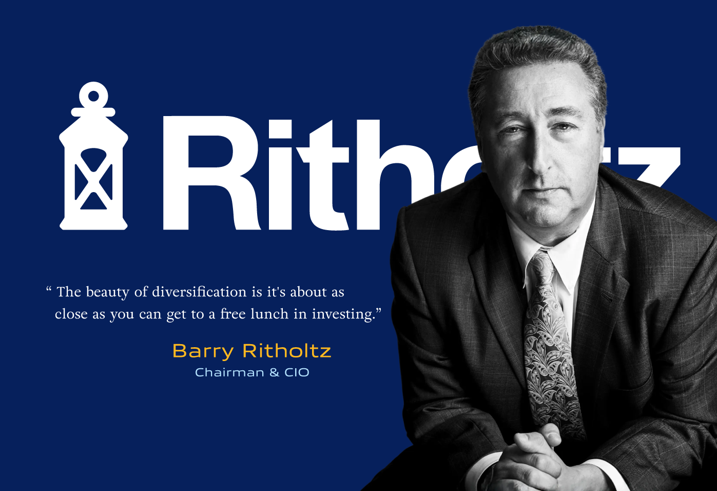
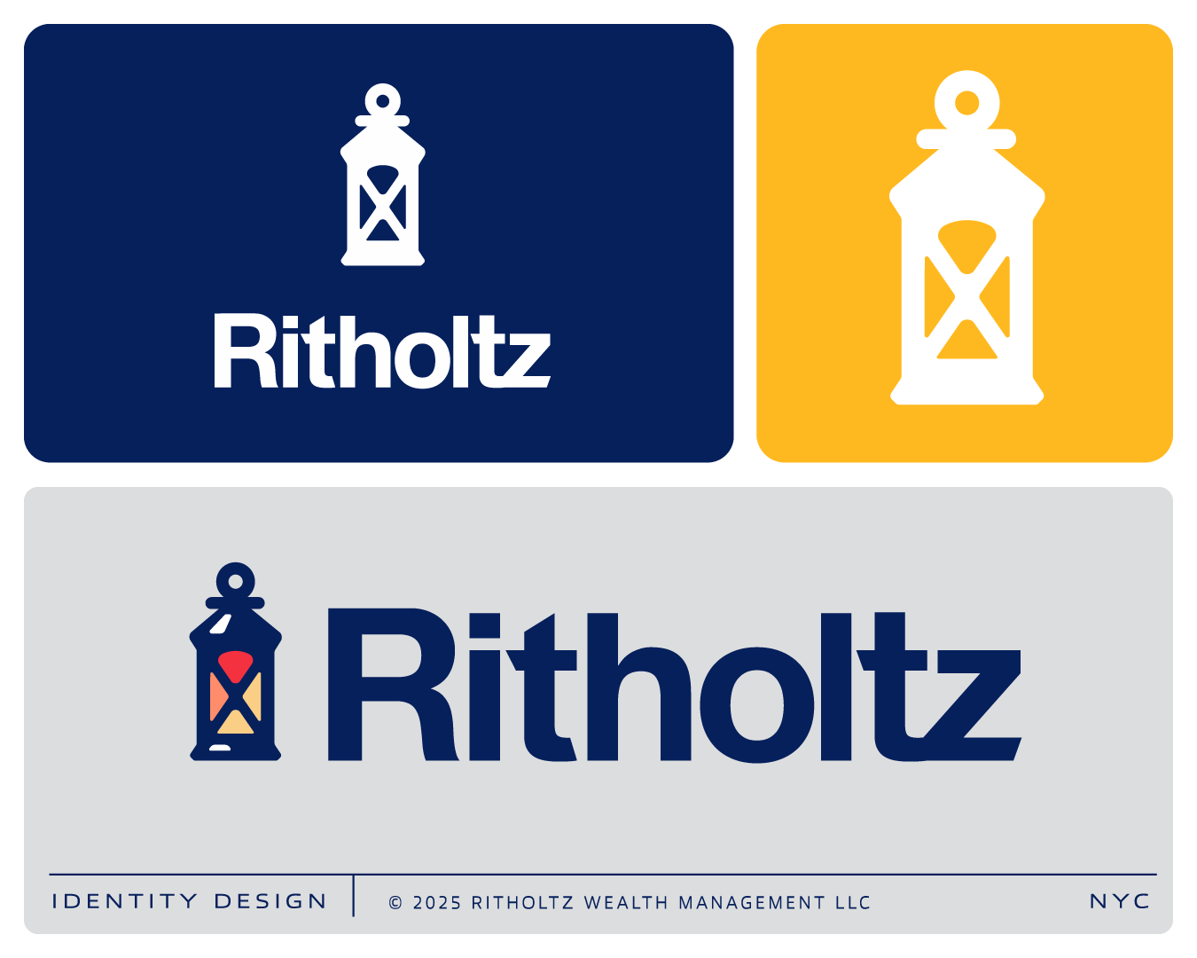
The logo depicts a wrought iron lantern shape that serves as a rich and comforting metaphor for financial guidance.
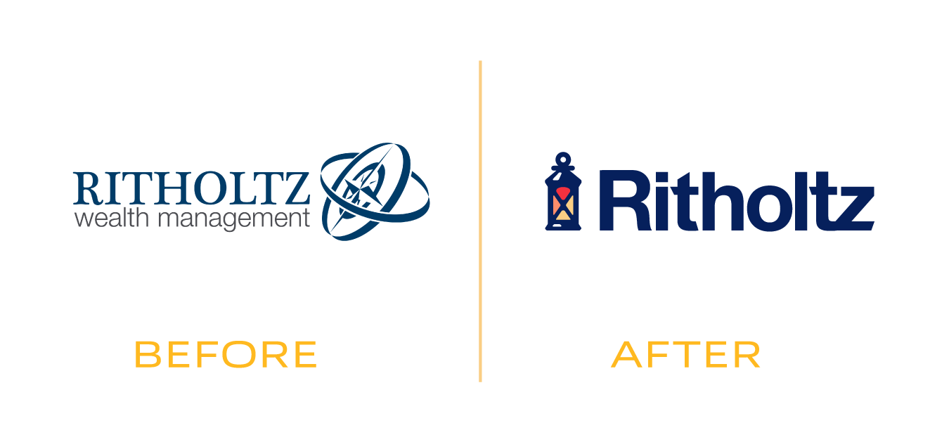
The existing logo was a fairly dated compass motif that had served its purpose but run its course. Armed with new experiences and a vibrant investing strategy story and team, I conceived of this lantern brandmark to tell their story.
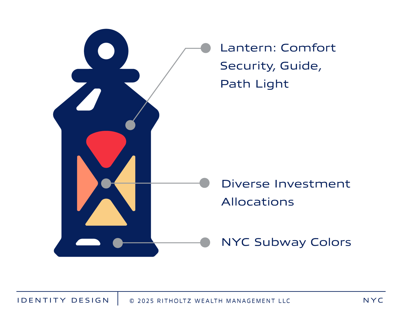

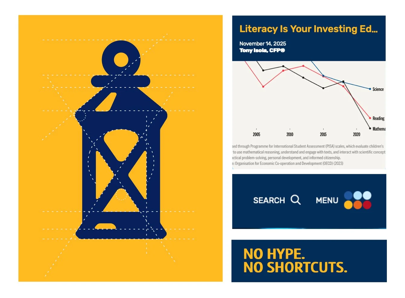
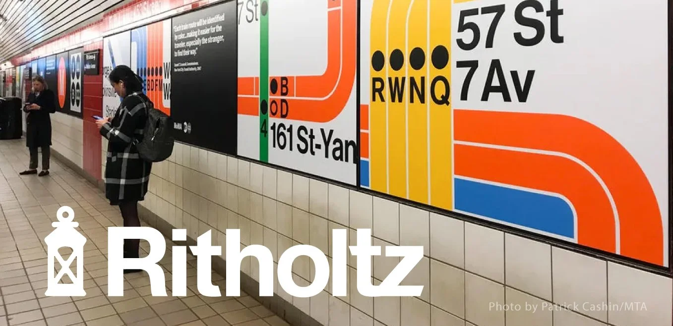
The logo colors forms and font are informed by the NYC Subeway system information design.
A bold, direct approach cuts through the noise, delivering clear insights and strategies tailored to your unique financial journey.
Source: Website design by wedu

The Ritholtz Way is about making rational investing decisions and deferring to the evidence in an uncertain world. Ritholtz believes everyone deserves access to high quality advice and portfolios that serve the objectives of their financial plan.
On The Compound, a podcast associated with the brand, the team at Ritholtz breaks down markets, strategies, and the stories that matter most. I was able to gleen a lot about their vibe, marketplace, chairman Barry Ritholtz, from that show.
wedü provided me with a cool New York City subway color palette and website styling cues, that also found some of its way into the forms, colors, and custom tyopography design here.
Logo Design and Font: Gregory Grigoriou
Art Direction: Thanks to Liam Roberge, Gavin McFarland | wedü
I’m always on the lookout for the next great branding mission. Contact me to discuss your needs and we’ll find out if I can get you where you need to go.
Thanks for viewing.